Sunday, May 27, 2012
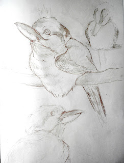
Because who doesn't like birds screaming profanities?
I've been working on a zine for a while now and FINALLY had the time to finish it (thanks summer). It's got a lot of poems and a few doodles and what not. Only ten pages long, but hopefully the first of many many more.
Bella's Portrait
I had an unsuccessful night of portraits the other night so I decided to do a portrait of Bella instead. Had a hard time with everything past her muzzle because she kept moving around. Did this in about 30 - 40 minutes.
water color landscapes
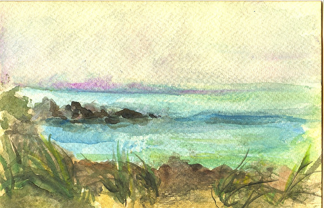
I spent a while at a secluded spot on a small beach and did a quick water color. I really don't know how to use water colors at all, but I actually like the way this came out. The only thing that disappoints me is that the darks in the foreground totally disappeared when it dried.
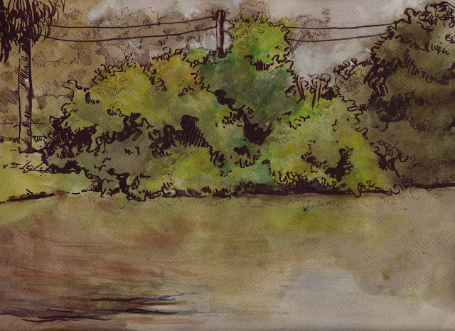
I did this landscape with Anna. One of my favorite spots close to the house. We lost light REALLY fast, so everything got a little confusing near the end and I had to bring in the ink to define things. I'm not totally unhappy with this one, but I had higher hopes for it when I began. I also should have gone much much darker in the foreground because that shadow mass was huge. Oh well. I still enjoy the composition.
Wednesday, May 23, 2012
Monday, May 21, 2012
Portrait 21
So about halfway through this grand photoshop adventure, I can feel myself losing it. I think I need to go back to traditional for a while.
Anyways, here's today's portrait: Christopher Gutierrez. Legit dude and always an inspiration. The source was from one of his recent photos in London because I really needed to draw someone in profile.
Too tired to get down on myself about this one. But colors just did not want to work with me today.
Friday, May 18, 2012
Portrait #18
Grandpa: Digital
If you missed my last post, I decided to broaden my 30 day challenge to general portraits instead of only self portraits. I drew Anna yesterday and I just finished this one.
My file is so large that it won't upload and I had to take a screen shot. hmmph. I'm really proud of this one, I think I'm finally getting the swing of photoshop and maybe by the time next semester starts I'll feel like I'm in a comfortable place with it.
Thursday, May 17, 2012
slight change of plans
With Anna's encouragement, I've decided to broaden my 30 day challenge from self portraits to just portraits in general. I really didnt think I'd get so burnt out on my own face, but alas, I really just CAN'T draw myself anymore. So today I did a fairly quick digital portrait of Anna, which is apparently too large to upload (I'll have to figure that out later). I also did another water color landscape today which, in my opinion, didnt turn out as successfully as the first. In addition to those, I still have a traditional self portrait to upload. Check back soon.
Wednesday, May 16, 2012
dreary day landscape
I decided to give my blog a break from my beautiful face. Also, I'm sick of drawing myself. I'm actually surprised with myself though- I havent missed a day yet in this self portrait challenge. Although some of them have either been super quick sketches, or just bad all together, which almost defeats the purpose of the challenge. That being said, I've decided that I'm not going to post every single portrait that I've done. Really only the ones that I feel have been successful or experimental enough to put up here.
Oh yeah, I almost forgot. I did a quick landscape of the lake behind my apartment in ink and watercolor.
The colors are a little bit similar, but it had literally just rained and anyone who lives in Florida understands just how green everything is after that. Also, I'm very weary of water. I've failed at it multiple times in the past. I didnt even plan on painting it because I've been focusing a lot on tree's lately. But I wanted to do a full landscape anyway, I just didnt pay extra attention to the water, but I still think it reads just fine.
Friday, May 11, 2012
Self Portrait #11: another digital!
My original plan was to upload the self portraits by week, but since I've just recently begun working digitally I thought I'd post today's portrait. I'm really proud of this one. I wish I was as good with color as I am with black and white.
Thursday, May 10, 2012
Fun with photoshop: "Sock Puppets"
I wanted to do something in photoshop but didnt feel like committing myself to another very tedious self portrait, so I decided to do something a little less serious and a lot more fun. Don't really know how this came to be. I wanted to do a kid with a deer sock puppet. Along the way it turned into a redneck, tom-boy sort of theme and I really love the way it turned out. I was very loose with the light source. I wanted the shadows to look convincing but didnt feel like I needed to make them perfect (I got extra sloppy with the big shadow on the bottom). But I think it worked pretty well, considering shadows are not my forte. It's a little hard to tell but deer is an oven mitt and the sock puppet on her other hand is a wolf. She has a squirrel in her pocket. I'm not going to lie, this took me ALL DAY to do. Granted, I woke up at 12, but...
original sketch.
Wednesday, May 9, 2012
meow
I did some sketches of my mom's cat over the weekend. Who doesnt love cats?* Thought I'd share.
*The answer is Bree. Bree doesnt love cats.
A few portraits from the first week
1. gestural portrait. 1 - 2 minutes in sketchbook.
2. ink on toned charcoal paper. Really confused about how my neck turned out the way it did. I think my shoulders arent high enough. Oh well.
3. nupastel on charcoal paper. I really like the way this one turned out.
4. boring old pencil.
7. Just a quick ink/acrylic in my sketchbook. I wanted to do something different and I like the way it turned out.
Wednesday, May 2, 2012
Semester II: 3D Invented Character and Environment
Oh boy. That's the only way to sum this project up. It felt like this one project took up most of the semester. In a way, it did. I put more time and effort into this project than any other project this year and I'm happy with the result.
The goal was to create an invented character of any kind (originally it had to be humanoid but thankfully they changed that) and then create an environment that it would realistically exist in. Both of these tasks acted as one project and the whole thing was really on a do-it-yourself schedule. The first step was to conceptualize. We had to come up with three completely different concepts and than choose on to carry into final.
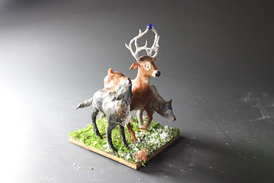
This is concept I chose of my three that I came up with. It's sort of a twist on a chimera, being an animal made up of two wolves and a white tailed buck. For a while I called it "K" for lack of an appropriate name. In the end I decided that I wouldn't give it one single name, instead all three animals have their own individual names.
Bio as it appears on D-Space:
My character is a creature of Inuit folklore, said to protect the wilderness. It often appears to those who are lost. It is made up of conjoined triplets; Akuniq, the buck in the middle guides his brothers, the wolves on either side of him, who in turn, hunt and rest while Akuniq stays awake constantly.
The buck’s antlers are knotted together in the front, a symbol of togetherness. They also hold and protect a blue orb which is their life force. Because of this, he is defenseless against his enemies and the wolves, Saumik (left) and Taliqpik (right), must fend off attackers.
The wolves represent the instinctual animosity within everyone, but their existence is vital to one another and their survival as a whole.
Note:
I strayed a little bit from my original concept sketches. I decided not to add leaves to the antlers. I also changed the gesture slightly to be a bit more interesting.
The first step was to create an armature out of wire and foil. That took me forever. It was practically like making three separate armatures and tying them together. In the end it all worked out, although I was pretty close to giving up all together. After the armature was complete, I added sculpy and baked it.
baked but unpainted.
After he was baked, I started painting. Shortly after the painting process began I also started the environment, which was made largely out of styrofoam and moss.
Finished character.
Final picture of the character in the environment.
Environment Bio as it appears on D-Space:
The environment for my character is the Alaskan tundra in spring time when the snow is just beginning to melt.
My environment also comes with an additional character: a young Inuit boy with a fishing pole and a map who is surprised to come across my character.
The environment is made largely out of styrofoam which I used for the base and also for the snow. I then covered it in a moss tarp and cut out a river which is filled with blue painted plastic wrap, super glue, gloss, and resin. Other materials include rocks, painted stick "birch trees", and various mosses.
A lighter picture of the environment.
River detail.
Additional character detail.
Semester II: I swear if I ever see another Kookaburra...
Our last few weeks of Drawing II were spent outside at the local "zoological gardens" doing animal studies. After studying the animals in general (mostly birds and reptiles and a handful of small mammals) we were instructed to choose one particular animal that we would study more closely and eventually turn into a character. After looking around Jungle Gardens for a bit and having an unsuccessful session with the Great Horned Owl, I settled on the Laughing Kookaburra. As the weeks passed I actually grew quite fond of the little guy, especially when he would call back to his son who was always in the bird show during the time we were there.
I will never forgive myself for getting messy with that ink....
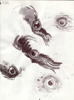
Eye studies and character development.
Sequential studies from videos.
Final character and sequence.
Concept: Kookaburras are considered the “king of the bush” but are actually similar to crows when it comes to being super tame scavengers. And they will actually steal food off of barbecues quite frequently. So instead of making my character all noble and whatnot, I made him blissfully ignorant with a paper crown as he goes around stealing food from locals.
This one is my favorite of the sequence.
Personal Work: Remembering an Old Man
During my second semester, my stepdad's dog died. Rocky W (the W is for Walker, to differentiate from my Mom's dog who is also named Rocky) was 11, which is pretty old for a shar pei. He was a great old fart, a little grumpy at times, but we all miss him a lot. I decided to do a quick piece in remembrance of Rocky for my family to have back home.
Done from a photograph.
Ink and watered down acrylic on charcoal paper.
Semester II: Self Portrait
It's far from perfect and the fact that I don't have any darker values is killing me as I look at this, but compared to the self portrait that I submitted when I applied for Ringling, the improvement is huge.
Charcoal on toned paper.
Semester II: so many sequences
A large part of my second semester of figure was sequential studies. It's hard to keep the likeness of the subject while doing these but it got progressively easier.
Gestural sequence in colored pencil.
A random in-class sequence. I ended up really liking this one, although I almost wish he would have stopped at the fourth step because I feel like the fifth (reading right to left, the fifth being the model on his stomach) really threw off the rhythm of the drawing.
Bree stretching.
For a homework assignment we had to draw two sequences from animated movies. One was supposed to be action based; the other emotion based. For my action sequence I chose a random soldier from Disney's Mulan throwing a pebble during "Be a Man". For the emotional sequence, I again chose a Disney movie, going with Wendy's father in Peter Pan. It was hard to pause the clip at perfect intervals to get a good sequence and it took a few screen shots to get it right, but I'm really proud of the way these turned out.
Both done in charcoal.
Subscribe to:
Comments (Atom)


